At tweede golf, we value innovation: we take the time to research new technologies and subsequently challenge ourselves to try out these new techniques in order to discover new applications. We also like to learn by doing: build something first, ask questions later.
At tweede golf, we value innovation: we take the time to research new technologies and subsequently challenge ourselves to try out these new techniques in order to discover new applications. We also like to learn by doing: build something first, ask questions later.
Following that philosophy, we recently held a programming contest. We gave ourselves two days to create new applications on top of our existing 3D framework. One of the teams created an app they dubbed "Skauti". It uses a 3D representation to visualize datasets.
Now is the time to look back: what are the benefits of 3D data visualization? Read on and find out.
 The Skauti prototype
We all like to base our decisions on data. However, just having a data sheet containing a lot of numbers will often not help you much, especially when the data set is very large. Graphs and visualizations are typcially used to obtain a better understanding of data. When it comes to presenting geospatial data (i.e. data which is dependent on some location) a 2D map is often the preferred solution.
Making sense of data
For centuries, cartographers (map-makers) have used projections and symbolism to create a 2D interpretation of the actual world. Nowadays, 2D maps are still widely used, as are traditional tools like adding colour, using markers and higlighting areas to indicate special points of interest with the goal of providing as much insight into the data as possible.
2D vs 3D
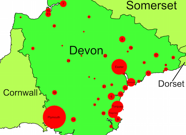
A more detailed look at the map above (which is a visualization of city sizes in Devon, England) reveals the limitations of 2D visualizations. Did you notice the tiny 35 (Topsham) under Exeter? And which city is bigger: Torquay or Paignton? Their bubbles overlap, making it harder to identify their sizes.
How to solve these problems? If we could use the third dimension as well, we could use a height instead of the circle radius to indicate city sizes. In addtion, we can simply choose a radius which makes sure there are no overlaps, making it easier to interpret the data.
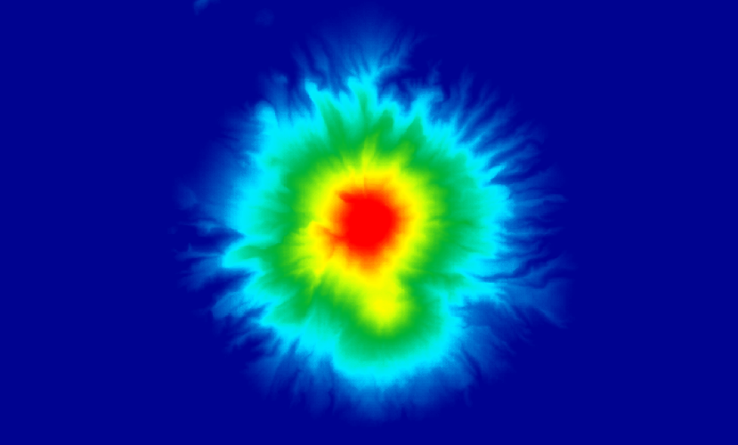
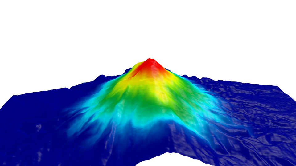
What about the use of colour? Sometimes color is used to indicate some value (for example in a heatmap). But what does green signify and how should we interpret red? If we compare the two maps of Mount Taranaki in New Zealand we can find below (one a traditional 2D height map, one a 3D representation), it is immediately apparent that the 3D version gives us more detailed information and it presents us with a more intuitive understanding of the mountain.
 © CC BY-SA Koordinates
 © CC BY-SA
3D visualizations can be run in your webbrowser using WebGL with vector based approaches instead of the pixel based tile maps often used for 2D cartography on the web. Not only does this look great, it has some more advantages: interaction becomes easier to achieve and scrolling and zooming can be made into a more smooth experience for the user.
The Skauti prototype
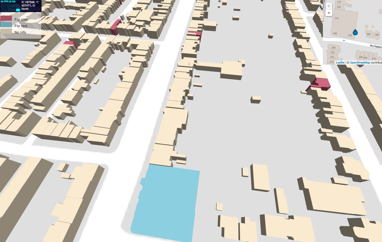
We wanted to make the most of these advantages. We set ourselves the challenge to create a small prototype of a 3D map. In this prototype we took our own city, Nijmegen, and we used building data provided by the Dutch government, specifically the BAG and AHN2 datasets, to determine where buildings are and how tall they are. We used these datasets before to create fancy point cloud visualizations.
We then picked some houses in our neighbourhood from Funda (a Dutch website listing properties for sale and for rent) and assigned them a color based on whether they were for sale or for rent. We also built a quick animation that gives the user access to more detailed information at the top of the screen.
*3D data visualization (dubbed "Skauti")*Above you can see what typical user interaction in this prototype is like. Given the fact it only took us the time span of a two-day programming contest to make this prototype, we can only imagine what can be achieved using this technique. If you see an application that is useful to you, do not hesitate to contact us.